
( Intro )
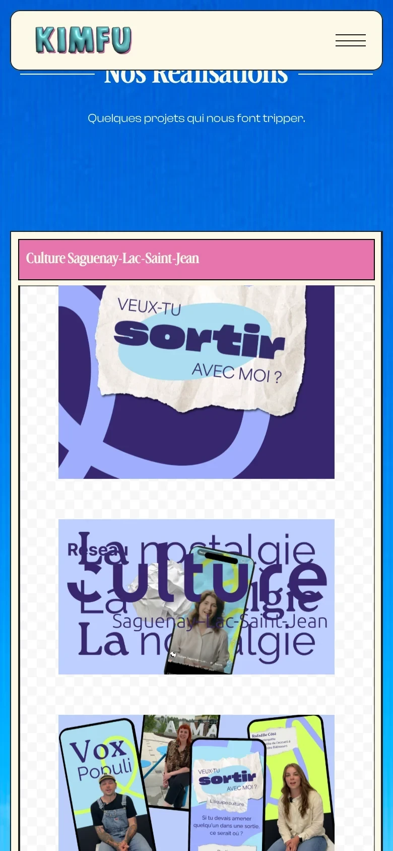
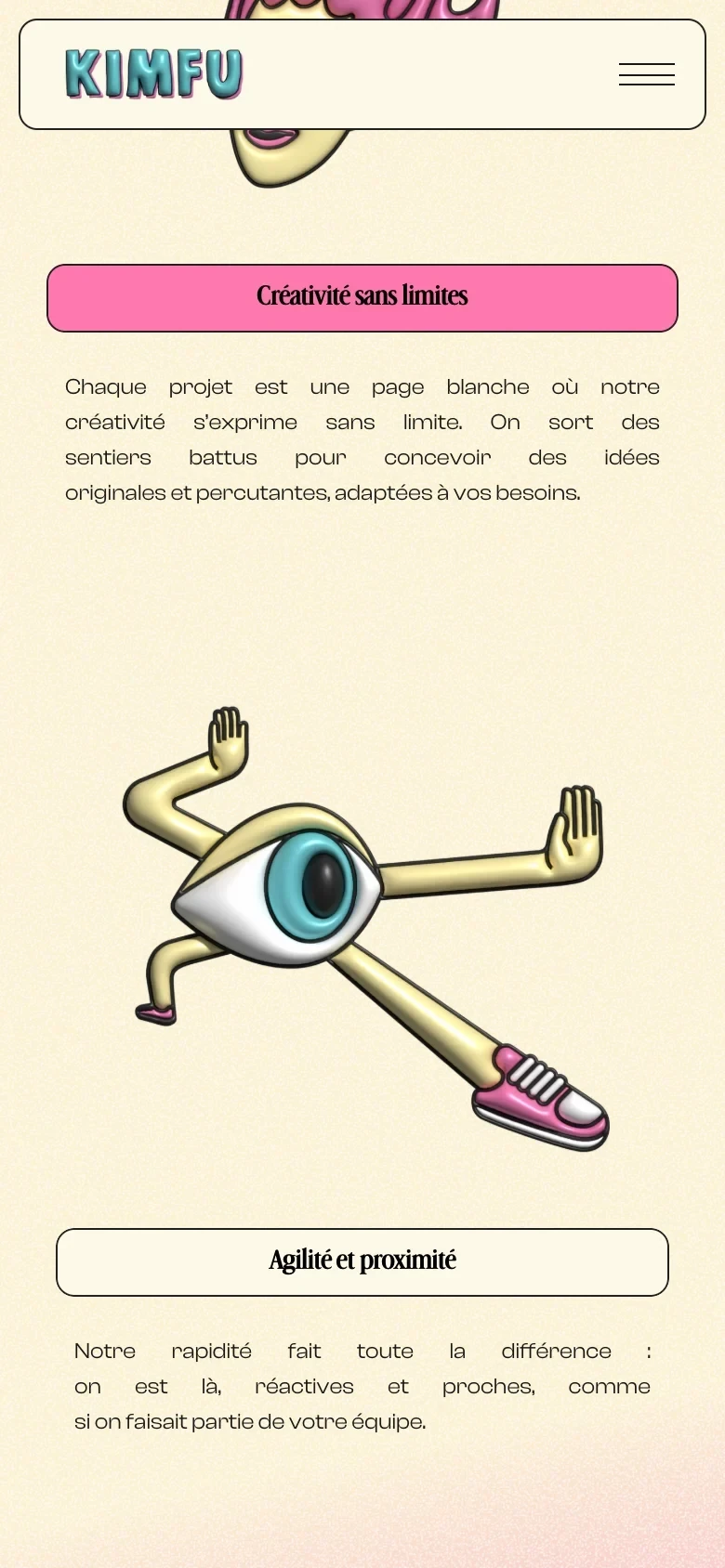
Kimfu wanted a website with room to explore. Starting from the agency’s brand colours, we developed a direction we called Retro Beige: warm backgrounds, pink accents, expressive type, and familiar desktop details with a playful edge. Stōkt handled the website’s art direction, design, and Framer development. The result gives Kimfu’s work, services, and team a shared visual language without flattening the personality that makes the agency distinctive.
( Credits )


( tech stack )


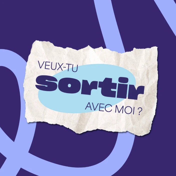
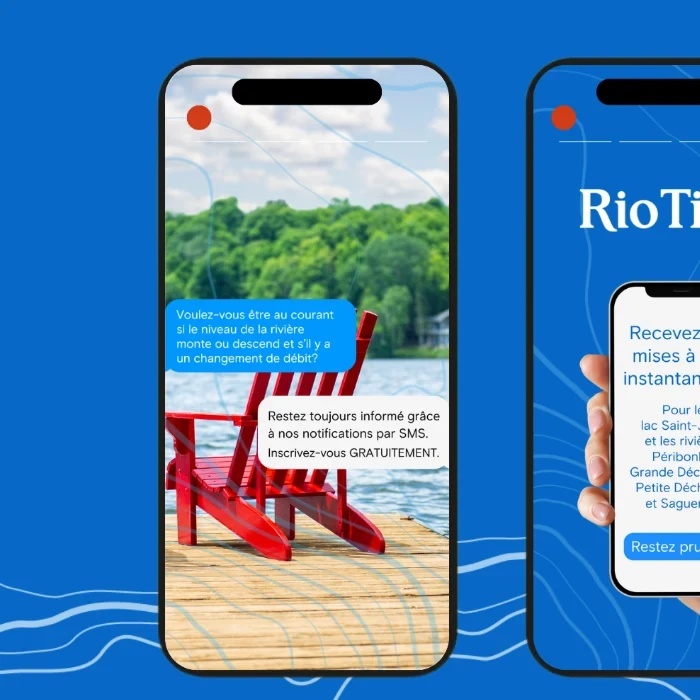
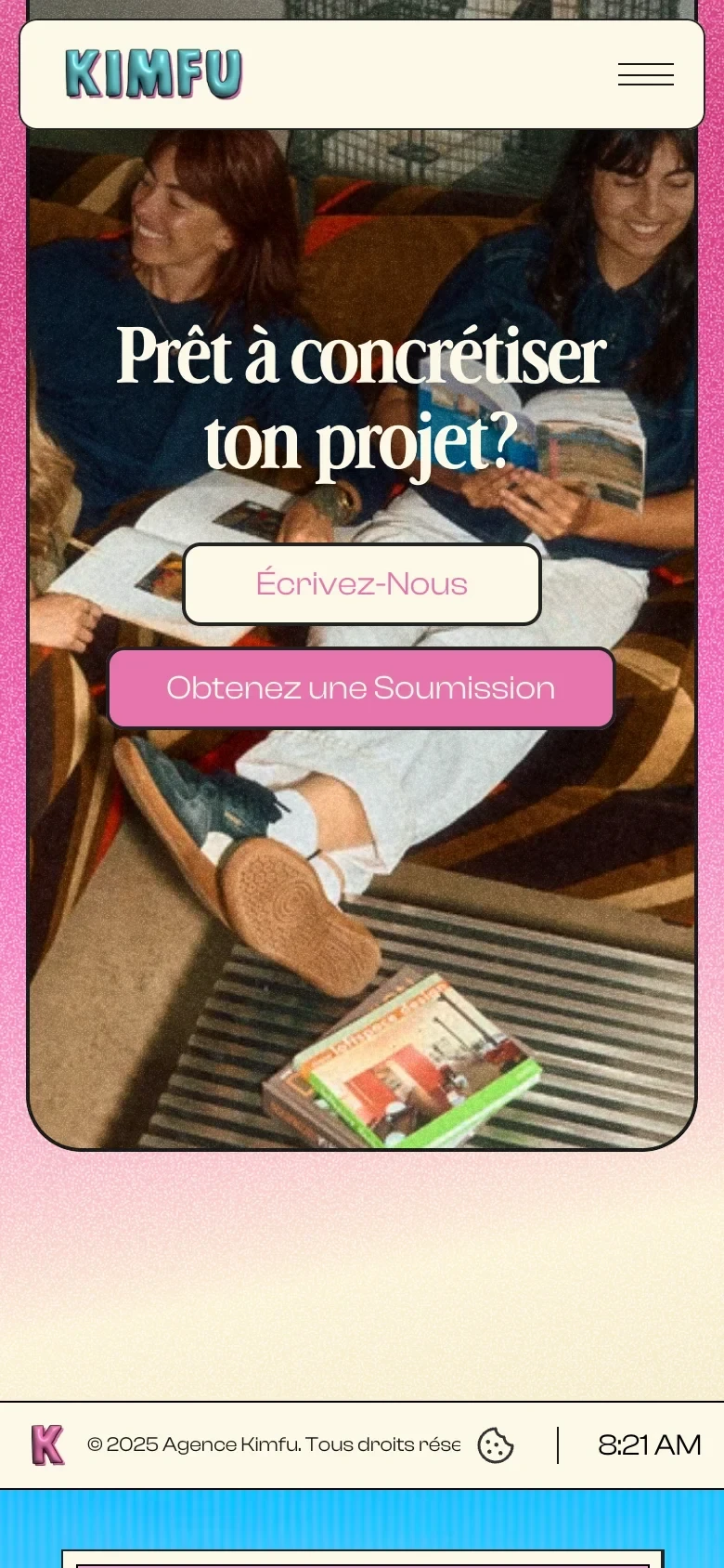
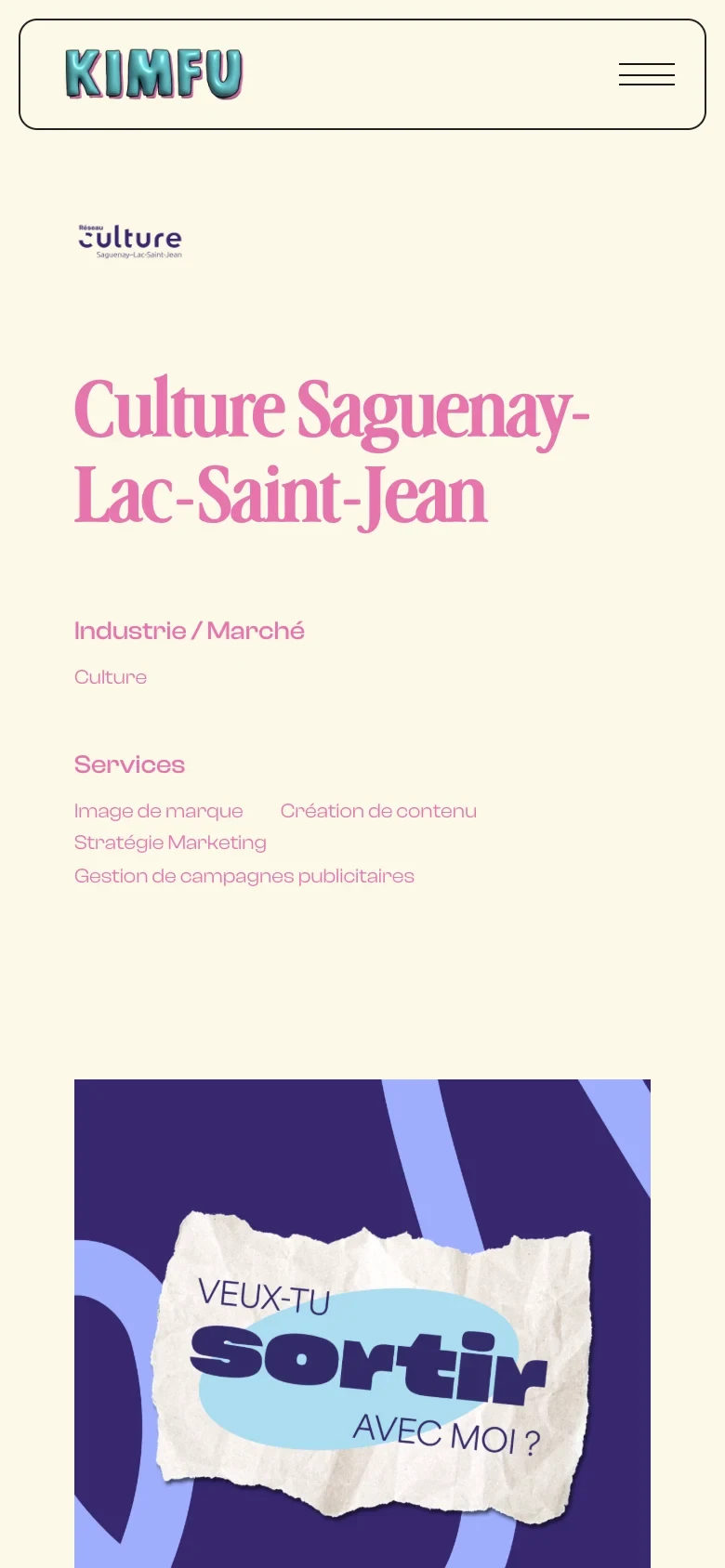
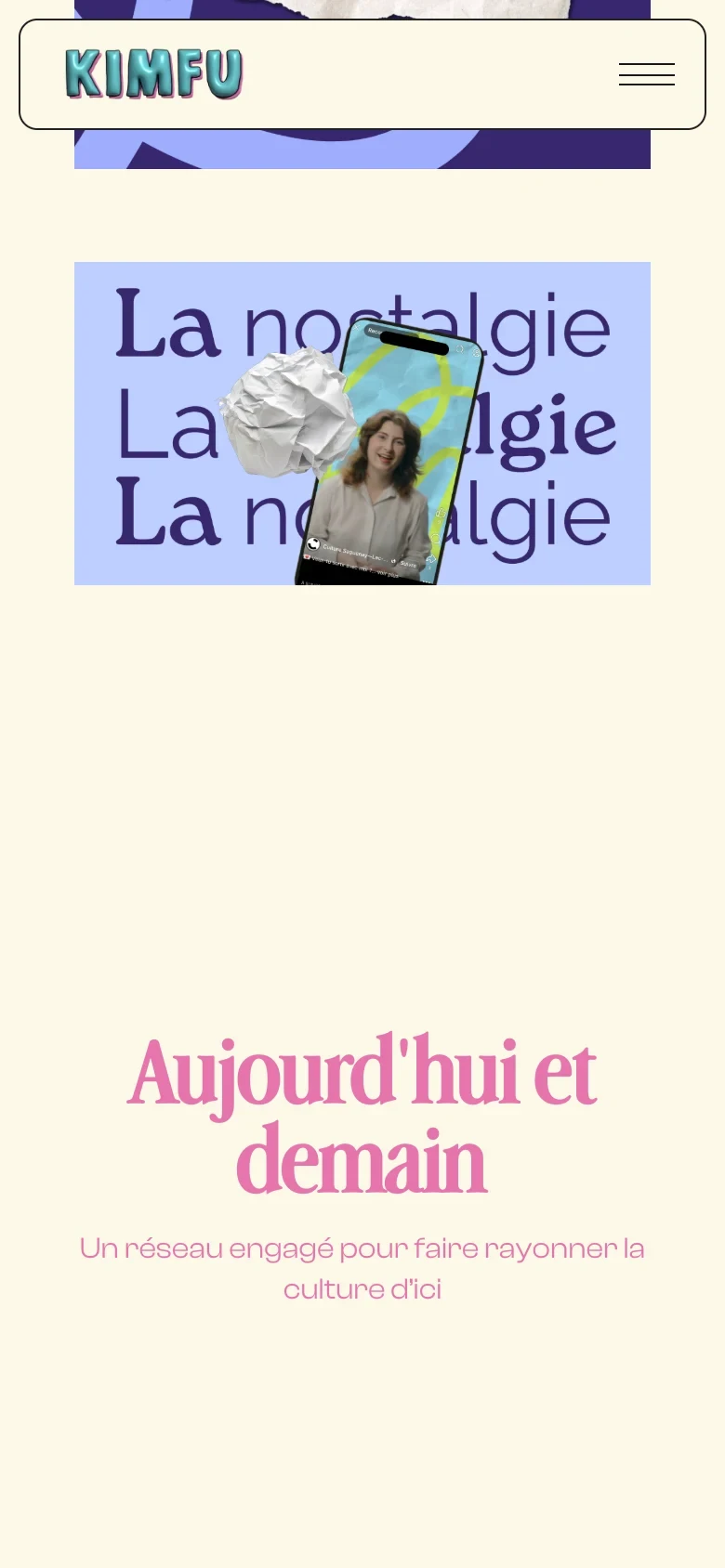
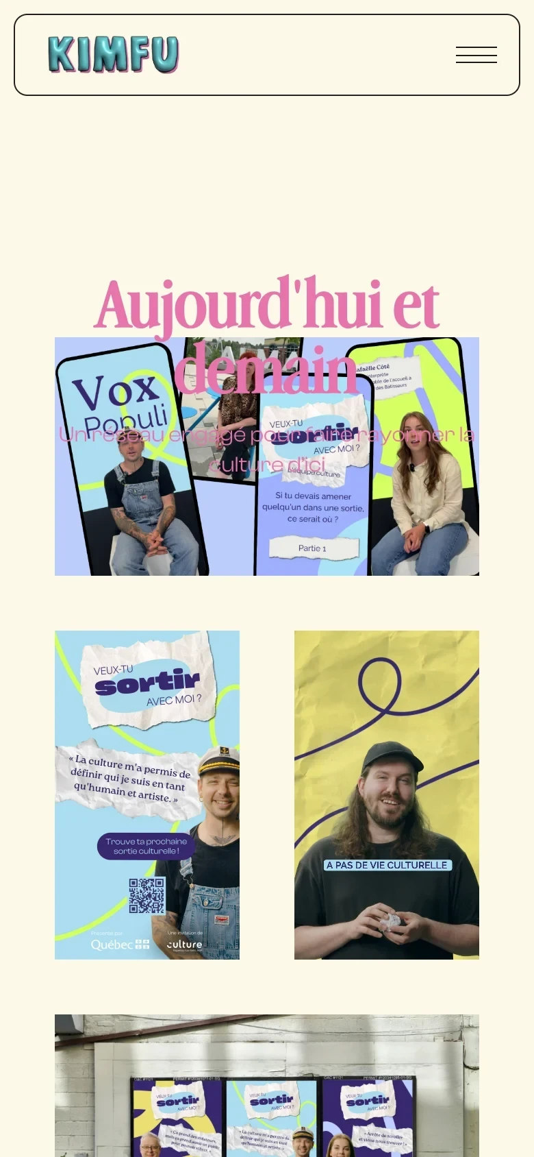
The website needed to show what Kimfu does and make it easy to start a conversation. We organised the experience around services, selected projects, the team, and clear contact points. Project pages use a flexible CMS structure, giving campaigns space for large visuals and short explanations. The recurring typography, colours, borders, and desktop-inspired details keep that variety connected to the agency.




( Responsivness )




( Gallery )

( Awards & Recognizions )

